The best HVAC websites, including Marina Mechanical Services, Elephant Energy, Magic Touch Mechanical, Hiller and Michael & Son, make it easy to confirm the company serves your area, trust the team doing the work, and call, book or get an estimate without guessing what happens next. They use real photos of their own work, a call and booking option on every page, an early coverage check, reviews next to the booking button, and clear information on price and next steps.
The best HVAC websites let a homeowner confirm you serve their area, decide they trust the technician coming to their house, and call or book without guessing what happens next. Marina Mechanical Services, Elephant Energy, Heat Geek, Magic Touch Mechanical, Morris-Jenkins, Hiller, Goettl, Michael & Son and Hoffmann Brothers each do at least one of those things well, and the patterns are worth copying whether you run one truck or forty.
We judged them on what a visitor can actually see and use, not on private conversion data, so read each example as a pattern to borrow rather than proof that one design books more jobs than another.
What makes an HVAC website book more service calls?
An HVAC website books more calls when it removes doubt at each step a homeowner takes before they pick up the phone. Most visitors arrive with one urgent question (is my AC repair something you do, here, soon) and leave the moment the answer takes effort to find.
Use this checklist on your own site before you look at anyone else's:
Then walk one real scenario on your phone: a homeowner needs furnace repair on a weekday evening. Start on the furnace repair page, not the homepage, and note every point where you hesitate.
Which HVAC company websites are worth learning from?
These nine sites each handle part of the booking decision unusually well. They are not ranked, and every observation below is based on the public site as it appeared in October 2026. All are US companies except Heat Geek, a UK installer network included for one idea worth copying.
1. Marina Mechanical Services: a premium brand built on real work
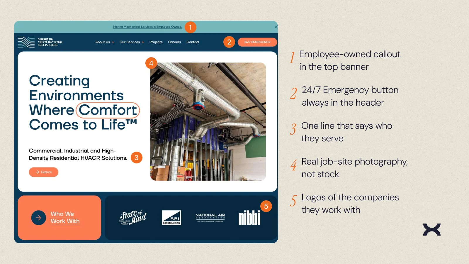
Marina Mechanical Services designs, installs and maintains HVACR systems for commercial, industrial and multifamily buildings, and its site looks the part: a confident display typeface, real job-site photography instead of stock, and one line under the headline that says exactly who it serves. A top banner notes the company is employee owned, a 24/7 Emergency button stays in the header, and logos of the companies it works with sit right below the hero. Further down, project cards label each multifamily build by name and city.
What to borrow: show your real work (named projects, job-site photos) instead of stock images, and keep emergency service one tap away on every page. A residential contractor can do the same with finished installs and the neighborhoods they're in.
2. Elephant Energy: shows the price range before you call
Elephant Energy installs heat pumps and heat pump water heaters in Colorado, Greater Los Angeles and Massachusetts. Its homepage includes an example estimate that breaks out installation, permits, rebates and financing, so a homeowner sees a likely total before talking to anyone. A four-step process (free estimate, expert consultation, installation, comfort) explains what happens next, the company promises one project manager per job, and its Google, EnergySage and Yelp ratings sit right under the hero.
What to borrow: if prices vary by job, show a realistic range and what it includes instead of hiding cost until a sales call, and spell out the steps after someone gets in touch.
3. Heat Geek: a first step that takes five seconds
Heat Geek is a UK network of certified heat pump installers, so its pricing and incentives don't apply in the US, but its hero is worth copying. The main action is a single address field that promises a personalized estimate in seconds, with a "Get your quote now" button always in the header and a bold, playful brand that stands out from typical trade sites.
What to borrow: make the first step something a homeowner can do in seconds, like typing an address, and let the site handle the qualifying questions after that.
4. Magic Touch Mechanical: premium design that still puts booking first
Magic Touch Mechanical in Mesa, Arizona looks more like a high-end home brand than a typical HVAC site, and its hero still covers the basics. A line above the headline says where it works and how long it has served the Phoenix metro, and two booking buttons split the work: one for AC and heating, one for fireplaces and media walls. Its A+ BBB rating, 3,000+ five-star reviews and National Contractor of the Year award sit right under those buttons, and the phone number and a Call Now button stay in the header.
What to borrow: put reviews and awards directly under the booking buttons, and if you sell more than one kind of job, give each its own booking button instead of one generic form.
5. Morris-Jenkins: friendly copy with the next step always in reach
Morris-Jenkins puts its phone number and a scheduling prompt at the top of the homepage, splits heating, cooling, plumbing and electrical into plain service labels, and shares stories from homeowners. Its call prompt also promises you will "talk to a REAL local person." The tone is warm, and the phone number and booking prompt stay visible as you scroll.
What to borrow: write service names the way homeowners say them, and if calls reach a local office, say so.
6. Hiller: it tells you whether you are booking or requesting
Hiller's appointment page explains two paths: schedule buttons that show real availability and lock in a time, or a form that the team follows up on. Visitors never have to guess whether submitting a form actually reserved a slot.
What to borrow: match button labels to what really happens. Use "Request an appointment" when someone has to call back, and save "Book now" for flows that confirm a time.
7. Goettl: answers coverage and cost questions before anyone asks
Goettl names the markets it serves (Las Vegas, Phoenix, Tucson, Austin, San Antonio and Reno) and handles the cost worry early, with offers like a waived service fee with every repair, complimentary estimates and a promise that the price it quotes is what you pay. Several promotions are labeled by market, so a visitor knows whether an offer applies to them.
What to borrow: say plainly how your service fee or estimates work, and label offers by area instead of promising the same thing everywhere.
8. Michael & Son: ZIP code check first, then urgent or planned work
Michael & Son asks visitors to enter a ZIP code to see which location serves them, next to its phone number and online booking, then highlights 24/7 emergency service, its verified reviews and financing. Heating and cooling menus separate repair, installation and tune-ups.
What to borrow: if you run several branches, let visitors confirm coverage early. A single-location contractor can get most of the benefit from a clear service area list. Our guide to location pages that rank and convert covers what each one needs.
9. Hoffmann Brothers: location pages that answer real questions
Hoffmann Brothers' Nashville page covers local service details, nearby communities, financing (with the approved-credit condition attached) and guarantees. It also separates 24/7 call intake from technician dispatch, which sets an honest expectation instead of promising an arrival time.
What to borrow: build location pages around what a local homeowner needs to decide, and be precise about what "24/7" actually means at your company. If you run several branches, these multi-location website design patterns show how to structure them.
What do the best HVAC websites have in common?

Across all nine, the same five elements show up again and again:
You can make most of these changes on your current site without a custom build, as long as you decide what a visitor needs to know at each step.
How should you prioritize changes to your own HVAC website?
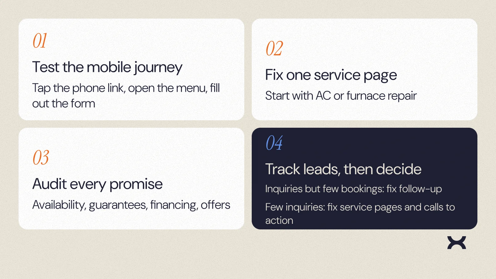
Start with the smallest set of changes you can measure, in this order:
If inquiries come in but don't turn into appointments, the problem may be follow-up rather than the website. If very few inquiries arrive at all, start with service pages and calls to action.
The same fixes work outside HVAC. On Brandywine Coach Works, a multi-location collision repair site we rebuilt for Quality Collision Group, phone contact actions per visit went from 6.0% to 8.8% and estimate requests per visit rose 2.5x after launch.
If you want a second set of eyes, NUUX runs website redesigns for service businesses focused on turning visits into booked calls.
Want results like this
Your website should make money, not excuses. Let us find the revenue hiding in your current experience.
FAQs
Quick answers to the questions we hear most about website conversion and UX design.
At minimum: a tap-to-call number on every page, online scheduling or a clear request form, separate pages for repair, replacement and maintenance, a service area list, reviews from a source visitors can verify, and plain information on visit fees, financing and guarantees.
Not always, but they need a clear, honest next step. Real-time booking helps when your schedule can support it. If staff must confirm a time, label the form as a request and say how fast you respond.
They match pages to how people search, by service and by location, and make each page genuinely useful. Google's local ranking factors are relevance, distance and prominence, so an accurate Google Business Profile and reviews matter as much as the website itself.
Only where each page has something real to say about that area, such as local services, response details or team information. Google's guidance warns against near-identical doorway pages created only to capture search traffic.
Track inquiries, booked appointments and completed jobs separately, by source. A site that produces many form fills but few confirmed appointments needs a different fix than one that produces very few inquiries.
Related articles
More field notes on conversion, UX, and building websites that sell.