.svg)
.svg)

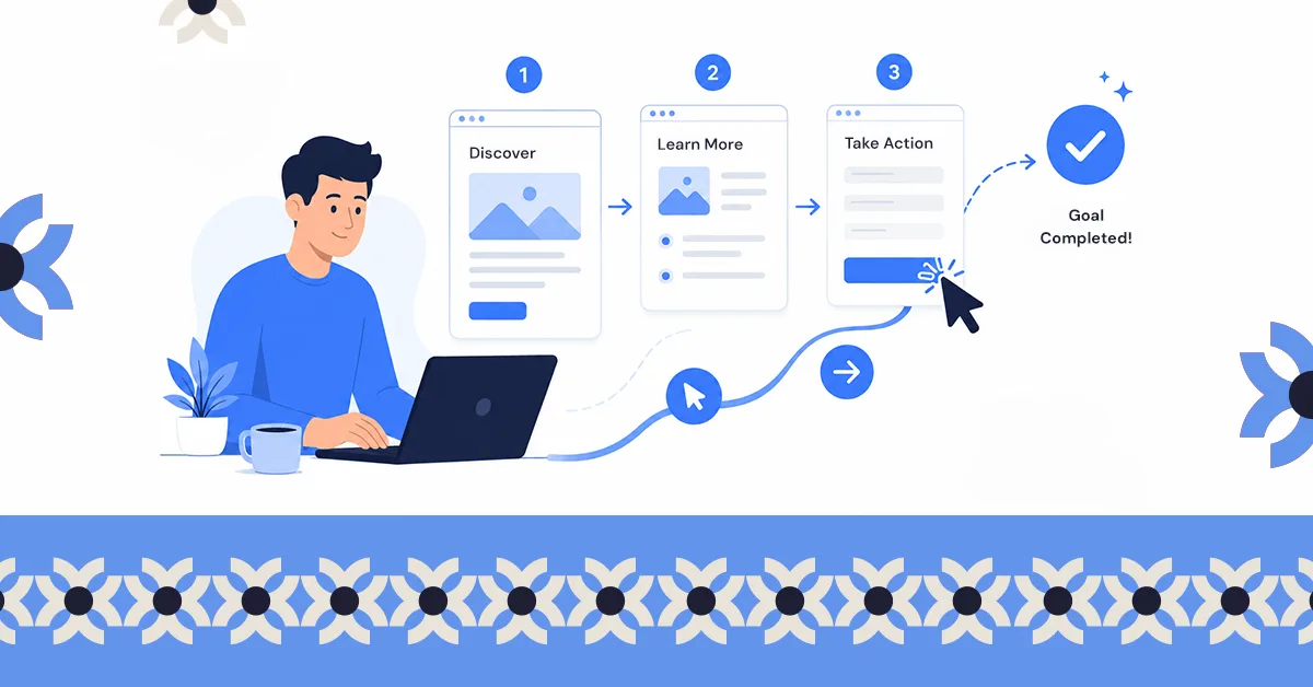
UX design is the practice of shaping how someone experiences a product so they can do what they came to do. For a business it is what turns traffic into conversions, which is why it affects revenue more directly than visual design does.
Most businesses treat their website like a brochure. Make it look good, keep the information clean, and trust that visitors will figure out the rest. That logic works fine until the analytics tell a different story: high traffic, low conversions, a checkout that quietly bleeds sales every single day.
The problem is rarely the design. It's the experience underneath it.
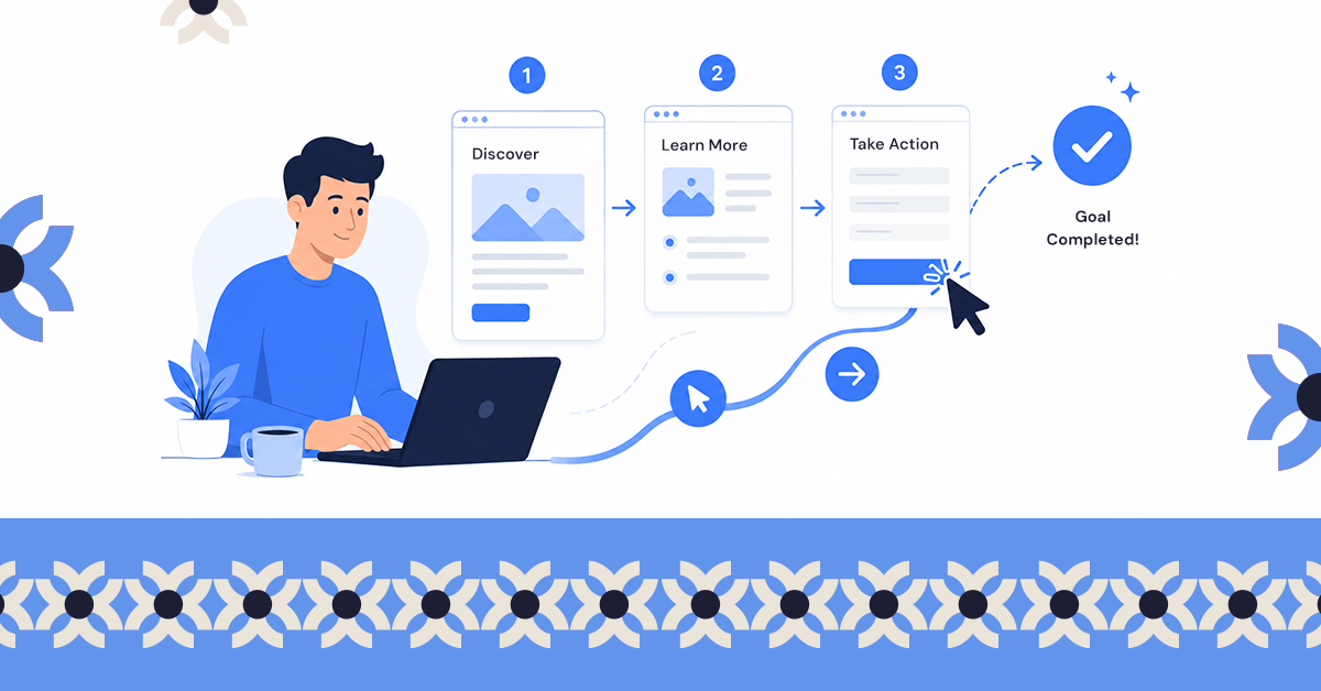
UX design is the discipline that closes that gap. It's what determines whether a visitor who lands on a page stays long enough to care, moves far enough to act, and leaves with enough confidence to come back. Most businesses don't think about it until something is visibly wrong. The ones who get it right build it in from the start.
This guide breaks down what UX design actually is, how it works, and why it matters far beyond aesthetics, written for business owners who don't have a design background but do have a website that needs to perform.
What Is the Difference Between UX and UI?
These two terms travel together so often that most people assume they mean the same thing. They don't, and confusing them leads to real problems, specifically, spending money on the wrong fix.
UI stands for user interface. It is everything you can see on a screen: the colors, the fonts, the buttons, the spacing, the way a page is laid out visually. UI design is concerned with appearance and aesthetics. A skilled UI designer makes a product look credible, consistent, and attractive.
UX stands for user experience. It is everything a person feels and does while using that product: whether the navigation makes sense, whether the steps to complete a task are logical, whether the right information appears at the right moment, and whether the whole journey from landing on a page to taking an action feels effortless or exhausting. UX design is concerned with behavior and outcomes.
The confusion happens because the two disciplines work closely together, but they solve different problems. A website can be visually stunning and still lose customers at the checkout because the flow is confusing. A site can be plain and simple to look at and still convert well because every step is obvious. Looks and logic are not the same problem.
A practical way to think about it: UI is the storefront window. UX is whether the door opens easily, the staff point you in the right direction, and the checkout line doesn't make you abandon your cart.
Here is how they break down side by side:
| UI Design | UX Design | |
|---|---|---|
| What it covers | Colors, fonts, buttons, icons, layout, visual style | Navigation flow, page logic, task completion, information hierarchy |
| The question it answers | Does this look good? | Does this actually work for the person using it? |
| What it affects | First impressions, brand perception, visual trust | Conversion rates, task completion, retention, customer satisfaction |
| Who notices when it fails | Anyone who sees the site | Anyone who tries to use the site |
| Real-world example | A beautifully styled checkout page with premium typography | That same page having 12 form fields and no guest checkout option |
| The analogy | The storefront window | The entire shopping experience once you walk inside |
How Does UX Design Affect Your Revenue?
UX is not a design preference. It is a business decision with measurable consequences.
Every point of friction in a digital experience is a place where a potential customer makes a quiet decision to stop. A confusing menu, a checkout form that asks for too much, a page that takes too long to load. None of these feel dramatic in isolation, but together they create an experience that works against the business. Visitors don't announce when something frustrated them. They just leave, and the business interprets it as a traffic problem or a marketing problem, when the experience was the problem all along.
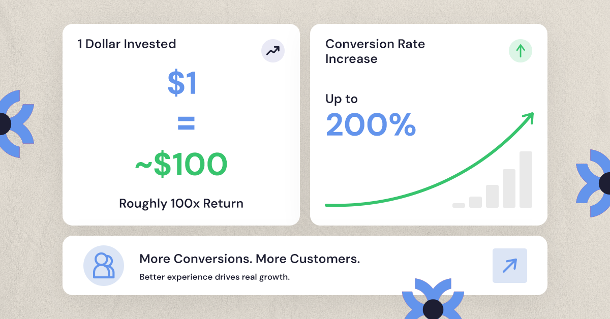
Beyond conversion rates, there is the trust dimension. A site that feels difficult to use says something about the business behind it, even if that impression is completely undeserved. People decide within seconds whether a website feels credible, and a cluttered or confusing experience quietly signals unreliability. That perception doesn't just cost a single sale. It raises the cost of every future customer, because more of them have to be acquired from scratch to replace the ones who left without converting.
That is the compounding cost of poor UX, and it rarely shows up as a single line item anyone can point to.
How the UX Design Process Actually Works
Most people assume UX design starts with visuals. It doesn't. By the time anything looks like a design, a significant amount of thinking has already happened.
It starts with research: understanding who is actually using the product, what they are trying to accomplish, and where the current experience is making that harder than it needs to be. This is not guesswork or assumption. It is the work of identifying real friction before anyone opens a design tool.
From there, the focus shifts to structure. How is the content organized? Can someone navigate to what they need in a few clicks without having to think about it? This stage, often called information architecture, determines the logic of a site before a single pixel is placed. Getting it wrong here means every visual layer built on top of it inherits the same problem.
Only after the structure is tested and validated does the visual design come in. Buttons, colors, typography, spacing. This is where UI design lives, and it matters, but it is finishing work, not foundation work.
The last stage is testing with real users, watching where they hesitate, where they misread something, where they abandon a task they intended to complete, and using that to refine. UX design is iterative by nature because user behavior rarely matches what a team assumed in a meeting room.
This is the same process that runs through a UX audit, which is often where businesses start when they know something is wrong but can't pinpoint exactly what.
What Good UX Looks Like in the Real World
Good UX rarely calls attention to itself. A well-designed checkout flow doesn't get noticed because it just works. A confusing one gets noticed immediately, and not in a way that helps the business.
For Chin Chin, a restaurant client, the goal was never a prettier website. It was a website and ordering flow that matched how customers actually wanted to browse the menu and place an order. The friction in the old experience wasn't obvious from the outside, but it was costing the business quietly. With the customer journey fixed end to end, the paid campaigns sending traffic to it have returned about 470% on ad spend across Google and Meta.
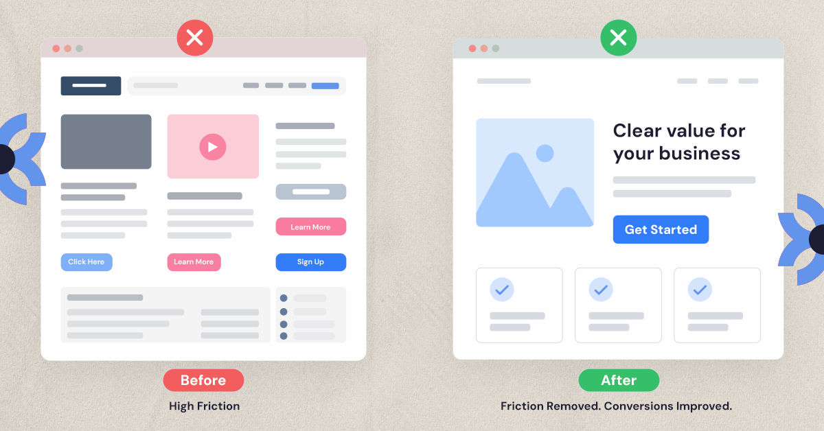
For AMAX Insurance, a UX-focused redesign of their quote process led to a 5.7% lift in quote completions. Not because the site looked different, but because removing a handful of unnecessary steps made it easier for visitors to finish what they started. Less friction, more conversions, same traffic.
The pattern holds across industries. Brands like Airbnb, Duolingo, and Spotify are frequently cited as strong UX examples not because their designs are flashy, but because using their products rarely requires effort.
Signs Your Business Needs Better UX
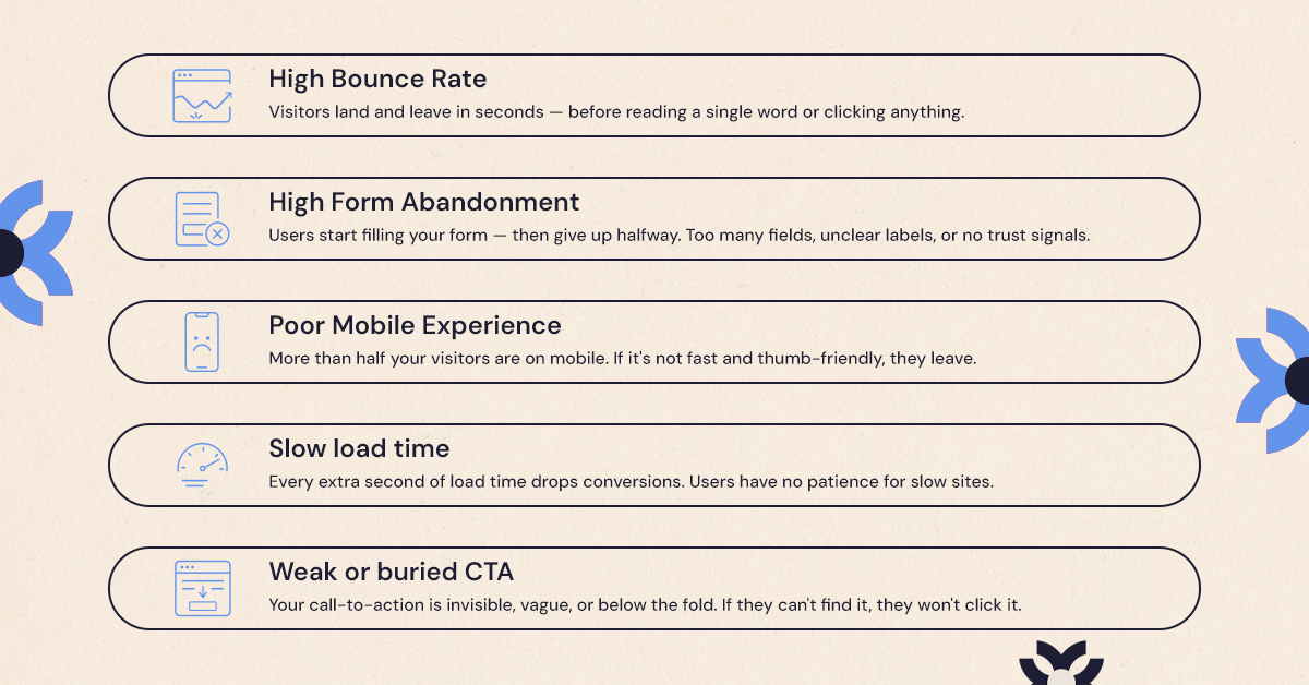
A few warning signs tend to show up before owners realize UX is the actual problem:
Visitors land on your site but bounce within seconds. Your contact form or checkout has a high abandonment rate. Customers tell you the site is "hard to use" even if they can't explain exactly why. Your bounce rate is high on mobile specifically. You've redesigned the visuals more than once but conversions haven't moved.
If any of that sounds familiar, the issue likely isn't how the site looks, it's how the user journey is structured underneath it.
The Bottom Line
UX design isn't a buzzword or a designer's pet project, it's the difference between a website that attracts visitors and one that turns them into customers. If you've been improving how your site looks without seeing the results follow, the experience underneath might be the real problem. Let's talk about what a focused UX review could uncover for your site.
Want results like this
Your website should make money, not excuses. Let us find the revenue hiding in your current experience.
FAQs
Quick answers to the questions we hear most about website conversion and UX design.
UX design is the practice of making a website, app, or product easy and pleasant to use, focused on how a person actually experiences it from start to finish.
No. Web design often refers to visual layout and aesthetics, while UX design covers the full experience, including usability, navigation, and how well the site helps a visitor complete a task.
Small businesses depend on every visitor converting into a lead or sale. Poor UX increases bounce rates and abandonment, while good UX design directly supports conversion and retention, especially when budgets don't allow for high ad spend to make up for it.
Common signs include high bounce rates, low form completion, confusing navigation, and customer complaints about difficulty finding information, even when the design looks visually polished.
Cost depends on the scope, whether it's a full redesign, a targeted audit, or ongoing optimization, and is usually structured around the size and complexity of the website or product involved.
Related articles
More field notes on conversion, UX, and building websites that sell.