.svg)
5 Great UX Design Examples and Why They Work

Looking for great UX design examples to inspire your next website, app, or digital product?
The best user experiences often go unnoticed. Users don't stop to admire the navigation, think about the checkout flow, or compliment the onboarding process. They simply find what they need, complete their task, and move on. That's exactly what great UX design is meant to do.
But what separates a good user experience from one that keeps people engaged, builds trust, and drives real business results? The answer lies in understanding how successful brands design around user needs, remove friction, and make every interaction feel effortless.
In this article, we'll explore five outstanding UX design examples from brands that millions of people use every day. You'll discover the user experience design principles behind their success, why these experiences work so well, and how you can apply the same ideas to your own website or product.
Whether you're improving an eCommerce store, redesigning a business website, or creating a new digital experience from scratch, these examples will show you what great UX looks like in practice.
What Is Great UX Design, Really?
UX design, short for user experience design, is the process of making websites, apps, and digital products easy to use. Good UX design helps people find information, complete tasks, and move from one step to the next without unnecessary effort.
When a website has a strong user experience, visitors can quickly understand where to go, what to do, and how to achieve their goal. Whether they're browsing products, requesting a quote, booking a service, or completing a purchase, the journey feels straightforward from start to finish.
Great UX design is built around user-centered design. Instead of making decisions based on assumptions, businesses design around how real users navigate, search, compare options, and make decisions. The result is a website that removes friction, improves usability, and supports higher conversion rates.
The best UX design examples all have one thing in common: they make the next step obvious. They guide users toward their goal while creating a seamless experience across every touchpoint.
With that in mind, let's look at five brands that have mastered UX design and the lessons businesses can learn from them.
Example 1: Duolingo — Making Hard Things Feel Easy
Learning a new language is genuinely hard. It takes months, sometimes years. Yet Duolingo has over 103 million monthly active users, and most of them didn't pay a cent to get started. So how does a language-learning app keep that many people coming back, for free?
The answer is in how the app is designed, not just what it teaches.
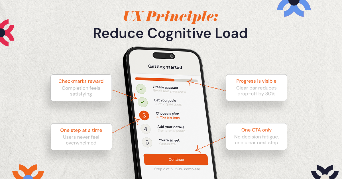
The UX Principle: Reducing Cognitive Load
Cognitive load refers to the mental effort required to understand and interact with something. The higher the load, the more exhausting it feels, and the more likely people are to give up.
Duolingo reduces cognitive load at every turn. The onboarding process is just five short steps. Once inside the app, the interface is clean, with high-contrast colors, large buttons, and lessons that take three minutes or less. There are no walls of text, no overwhelming menus. Just one clear task in front of you at a time.
Add to that the gamification layer: streaks, progress bars, achievement badges, and daily reminders. These aren't just fun; they're grounded in behavioral psychology. Small, visible wins trigger dopamine and build habit loops. Users don't just complete lessons; they come back for them.
Research from Bain & Company and Harvard Business School found that improving retention by just 5% can increase profits by 25% to 95%. Duolingo's entire design is engineered toward that exact outcome.
Your takeaway: If your onboarding flow, checkout process, or signup form asks users to make too many decisions at once, you're losing them before they see your value. Break it into smaller steps. Show progress. Celebrate small wins.
Example 2: Airbnb — Designing for Emotion, Not Just Function
Most travel booking platforms work the same way. You search by location, filter by price, sort by rating, and choose. It's functional. It gets the job done. But Airbnb doesn't work that way, and that difference is worth billions.
Instead of asking you to filter by "number of bedrooms" or "distance from city centre," Airbnb asks you what kind of experience you want. Filters include categories like Cabins, Castles, Beachfront, Treehouses, and Earth Homes. You're not searching for accommodation. You're searching for a feeling.
The UX Principle: Emotion-Driven Design
User-centered design doesn't just mean making things easy to use. At its best, it means understanding what users want to feel, not just what they need. Designers co-founded Airbnb, and that influence shows up in every part of the product.
Trust is also baked in throughout the experience. Verified reviews from real guests, detailed host profiles, transparent pricing, and clear cancellation policies all work together to answer the question every user is quietly asking: Is this safe? Will I regret this booking?
By addressing both the emotional desire (the experience they want) and the rational concern (the risk they're taking), Airbnb moves people from browsing to booking with far less friction than its competitors. Its design-led culture is inseparable from its $75 billion-plus valuation.
Your takeaway: Think about how your website makes visitors feel, not just what information it gives them. Does your homepage answer the emotional question your customer is bringing with them? Does your design remove doubt, or create it?
Example 3: Spotify — Personalization That Feels Like Magic
Spotify was not the first music streaming service. When it launched, well-established competitors were already in the market. What set it apart wasn't a bigger library or a lower price. It was the experience of feeling like the app actually knew you.
Discover Weekly. Release Radar. Daily Mixes. Spotify Wrapped. These features share one thing in common: they make every user feel as if the product was built specifically for them. That's not an accident; it's a deliberate design strategy built around personalization.
The UX Principle: Personalization Reduces Friction and Increases Engagement
When a product surfaces content that matches your taste without you having to ask, it removes the friction of searching. You don't have to dig through 100 million songs, Spotify puts exactly what you're likely to enjoy right in front of you the moment you open the app.
Spotify Wrapped takes this even further. Once a year, Spotify transforms your listening data into a shareable, visual story about your musical year. It's a UX feature that becomes a marketing moment, users voluntarily share it across social media, generating free visibility for the brand. That's great UX design doubling as a growth strategy.
The numbers back this up. A 5% increase in customer retention can increase profits by 25% to 95%, according to Bain & Company. Personalization is one of the most effective tools for getting there.
Your takeaway: You don't need Spotify's data science team to personalize your experience. Even small touches- a returning customer seeing their previous order, a product recommendation based on browsing history, or a simple "welcome back" message, can measurably improve conversion and loyalty.
Example 4: Netflix — Removing Every Reason to Hesitate
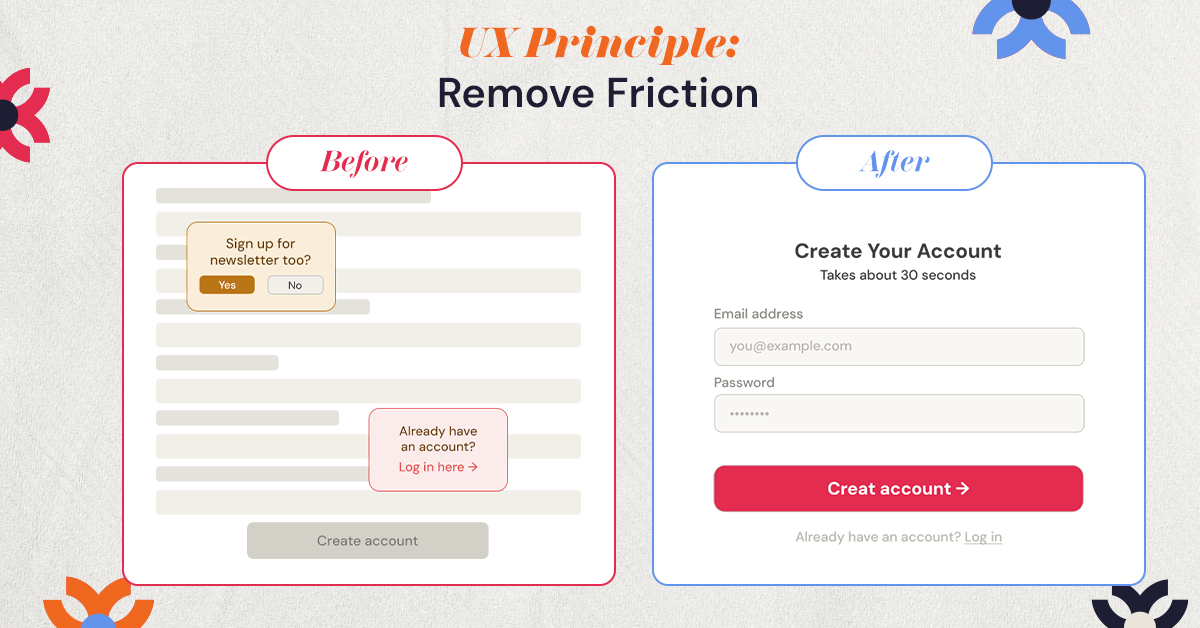
Think about how many times you've opened Netflix unsure what to watch — and still ended up watching something. That's not a coincidence. Netflix has spent years building an experience specifically designed to eliminate the one thing that might make you close the app: the feeling of having nothing to watch.
But beyond recommendations, it's the small design decisions that add up. The "Skip Intro" button. The "Continue Watching" row. The autoplay feature that starts the next episode before you've made a conscious decision to keep going. Each of these anticipates what you want next, and removes the moment where you'd have to decide.
The UX Principle: Anticipatory Design
Anticipatory design means predicting what a user will want to do next, and making that action as effortless as possible. Every click you save, every question you answer before the user has to ask it, is a reduction in friction, and a reduction in the chance they'll leave.
Netflix's sign-up page reflects this thinking clearly. One field. One clear call to action. No lengthy forms asking for information they don't need yet. According to Maze, well-designed UI can boost conversion rates by up to 200%, and this kind of stripped-back signup flow is a core part of why.
The Baymard Institute, which has spent over 200,000 hours researching eCommerce UX, found that simply optimizing checkout design can boost conversions by 35.26% for large eCommerce sites. Every unnecessary field, every confusing label, every moment of doubt, all of it is costing you customers. If your website isn't converting, this is often exactly why.
Your takeaway: Look at your website right now. Where do users have to pause and think? Where are there too many options? Where is the next step unclear? Every one of those moments is a leak in your funnel, and fixing them doesn't always require a full redesign. It requires attention.
Example 5: What NUUX Did for Chin Chin — Great UX Isn't Just for Tech Giants
The four brands above are all household names with enormous design and engineering teams. So it's fair to ask: do these UX principles actually apply to regular businesses? The short answer is yes, and here's a real example to prove it.
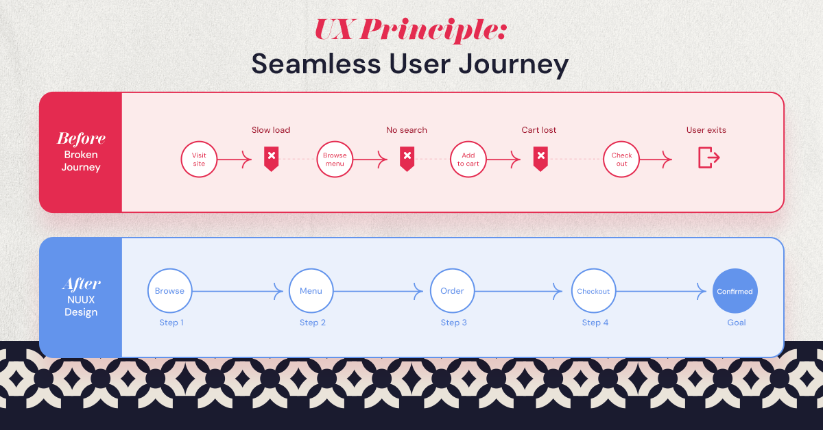
Chin Chin is an authentic Asian restaurant brand that came to NUUX Design Studios with a very common digital problem. Their website was on Squarespace, but when customers clicked to place an order, they were taken to a completely different platform, Patronix's hosted ordering system. Different branding. Different layout. Different feel entirely.
The UX Problem: A Broken Journey
This kind of disconnected experience is one of the most damaging UX issues in hospitality and eCommerce. Users begin their user journey in one environment and are suddenly dropped into another. The visual language changes. The trust signals disappear. And without even realising it, many customers simply close the tab.
On top of that, there was no cross-domain tracking in place. Chin Chin had no visibility into where customers were dropping off, how ads were performing, or what was working in their marketing funnel. They were operating almost completely blind.
What NUUX Did
NUUX rebuilt the website in Webflow and designed a visually aligned ordering subdomain, meaning the ordering flow now looked and felt identical to the main site, even though it was still running on Patronix behind the scenes. For the customer, it was seamless. No visual jolt. No disruption in trust. Just one continuous experience from browsing the menu to completing the order.
NUUX also implemented full cross-domain tracking and built a connected marketing ecosystem, linking Meta, Google, and email campaigns to a consistent, conversion-optimised environment. Customer data was being captured and used strategically for the first time.
The Result
Within the first year, the redesigned ecosystem generated over $150,000 in online revenue, not because of a flashy new look, but because the user journey was unified, friction was removed, and the experience finally matched what the brand was promising.
NUUX applied the same thinking to AMAX Insurance, where a single quote flow was trying to serve two completely different types of users, people who wanted a quick estimate, and people ready to commit to a full application. By redesigning around those two distinct intents, the quote completion rate increased by 10%.
The principle is the same whether you're a restaurant or an insurance company: understand how your users actually behave, remove the friction between them and their goal, and the business results follow.
Your takeaway: Good UX isn't a luxury for companies with large design budgets. It's the clearest path to better conversion, higher retention, and real revenue growth — for any business, at any size.
All 5 Examples at a Glance
The Takeaway
The difference between growth and missed opportunity is often found in the smallest details. A longer path, an unexpected interruption, or a missed expectation can change the outcome of an entire customer journey.
The best UX isn't about impressing people. It's about helping them move forward with confidence. The question is: what's standing between your users and the action you want them to take?
That's where thoughtful, user-centered design makes all the difference.
If you'd like to explore what better UX could do for your business, book a free consultation with us here, we'd love to hear from you.
.svg)

.jpg)


.svg)

.svg)

.svg)
