.svg)
UX Design for ADA Compliance: What Government Sites Must Get Right
.jpg)
In April 2026, the Department of Justice pushed the ADA Title II web accessibility deadline back a full year, from 2026 to 2027 for larger jurisdictions and to 2028 for smaller ones. Plenty of government teams read that as breathing room. It is not. The extension buys time to get the work right, not permission to postpone it. And the work that actually moves the needle happens earlier than most teams assume: at the design stage, before a single line of code exists.
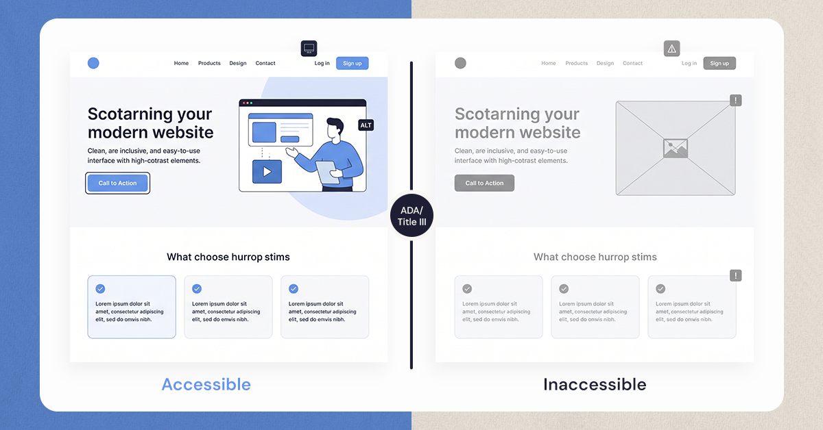
Accessibility is often treated as a technical patch applied after launch, a checklist for developers to work through once the site is built. That approach explains why so many government websites still fail basic standards years after teams believed the problem was solved. Accessible design and general UX design are not separate disciplines. The same choices that make a site usable and clear for a resident on a smartphone are the choices that make it usable for a resident with a screen reader. Getting UX design right for ADA compliance means building accessibility into wireframes, navigation systems, and content structure from day one, not retrofitting it afterward.
The Compliance Timeline Just Moved, the Bar Did Not
Under the Department of Justice's 2024 Title II rule, state and local government websites must conform to WCAG 2.1 Level AA, the international standard developed by the World Wide Web Consortium. In April 2026, the DOJ issued an interim final rule extending the compliance dates: public entities serving populations of 50,000 or more now have until April 26, 2027, pushed back from the original April 2026 date. Entities under 50,000, along with special district governments, have until April 26, 2028. The DOJ cited resource constraints, staffing limitations, and the limits of current technology (including generative AI) for large-scale remediation as reasons for the extension.
The substantive requirement has not changed. Only the clock has. The DOJ has stated it "fully anticipates implementing the regulation at the new deadline," and existing nondiscrimination obligations under Title II remain in effect regardless of the extension, meaning a resident could still bring a complaint before 2027 if a site denies them equal access to a service. Municipalities that treat the extra year as a pause risk arriving at the new deadline with the same unresolved design debt, just older, and litigation around inaccessible public-facing digital services has continued climbing industry-wide during this window.
WCAG 2.1 AA is organized around four principles known as POUR, and every design decision covered in this guide traces back to one of them:
- Perceivable — content must be presentable in ways residents can register, regardless of sense. A form field needs a visible label, not just a color cue; a video needs captions, not just audio.
- Operable — every interactive element must work by keyboard alone, not just mouse or touch. If a resident cannot Tab to a "Submit" button, the form fails this principle regardless of how it looks.
- Understandable — content and navigation behave predictably. Error messages explain what went wrong in plain language, and navigation patterns stay consistent from page to page.
- Robust — content works across assistive technologies, current and future, including screen readers, voice input, and browser zoom.
A site can pass an automated scan and still fail residents on one of these four principles, which is exactly why design decisions, not just code fixes, sit at the center of compliance.
Accessible Design Starts With Navigation, Not Alt Text
Most accessibility conversations jump straight to alt text and skip the layer that affects every single visitor: navigation. Residents with motor disabilities, repetitive strain injuries, or temporary limitations like a broken arm often cannot use a mouse. They rely on a keyboard, pressing Tab to move between elements and Enter to activate them.
This is a design decision, not a developer afterthought. Focus indicators, the visible outline showing which element is currently selected, need to be part of the design system from the start, styled with the same intention as buttons and headers. Tab order needs to follow the visual layout a designer laid out, left to right, top to bottom, so navigation feels predictable rather than erratic. Skip navigation links, which let a keyboard user jump straight to main content instead of tabbing through an entire header menu, are a wireframe decision, placed deliberately at the top of the page structure.
Our UX design process treats these elements the same way it treats visual hierarchy: as structural choices made before development begins, not styling applied after.
Designing Forms for Civic Tasks Residents Cannot Avoid
.jpeg)
A resident cannot skip paying a utility bill or filing a permit application the way they might skip an optional newsletter signup. Government forms carry a weight that most commercial forms do not, which makes their design a compliance issue and a usability issue at the same time.
Every field needs a visible, programmatically associated label, not just a placeholder that disappears once someone starts typing. Error messages need to explain the problem in plain language and point to exactly which field caused it, rather than a generic banner reading "form submission failed." Long civic forms benefit from being broken into logical steps with clear progress indicators, so a resident filling out a permit application understands where they are in the process and what remains.
Color and Contrast Are Design Decisions, Not Developer Fixes
A resident trying to pay a parking ticket on a phone in bright sunlight, or a resident with low vision or color blindness, needs sufficient contrast to read the page at all. WCAG 2.1 AA requires a contrast ratio of at least 4.5:1 for standard text against its background, and 3:1 for large text and graphical elements like icons or form borders. That ratio is not a rule for the development team to catch during QA. It belongs in the design system itself, baked into the color palette before a single component gets built.
Color alone also cannot carry meaning. A required field marked only by red text, or a status marked only by a green dot, excludes the roughly 1 in 12 men and 1 in 200 women who have some form of color vision deficiency. Pairing color with a text label, icon, or pattern solves this at the design stage, long before a developer ever touches the component.
The most common failures on government sites, red error text on dark backgrounds, pastel event banners with white text, light gray placeholder text standing in for real labels, all trace back to a palette that was never run against contrast standards during the design phase. Retrofitting color after launch usually means reworking an entire visual identity, which costs far more than testing swatches against a contrast checker during the first design sprint.
This same discipline directly affects how well residents complete tasks on a page in the first place, since the principles behind a strong conversion rate rest on the same foundation as accessible contrast: can a visitor read it, understand it, and act on it without friction. Whether that action is completing a survey or finishing a payment, legible design serves accessibility and usability at once, because they are rarely two separate goals.
Content Structure That Works With Screen Readers From the First Wireframe
.jpeg)
Screen readers do not "see" a page the way a sighted visitor does. They rely entirely on the underlying structure, which is why heading hierarchy is a design decision with real consequences. A page with headings applied in logical, descending order (H1, then H2, then H3) allows a screen reader user to jump directly to the section they need. A page where headings are chosen for visual size rather than logical order leaves that same resident scrolling through content they cannot skip past.
The same logic applies to documents. A staff member who prints, signs, and scans a form creates a PDF that looks like text but reads as a photograph to a screen reader. Designing public-facing documents as accessible web pages instead of scanned PDFs, whenever the content allows it, removes this barrier entirely. Where PDFs are unavoidable, they need to be built with proper tagging from the source file, not scanned after the fact.
Vendor Tools and the Overlay Trap Design Teams Fall Into
Government sites rarely run on custom code alone. Bill payment portals, permit systems, GIS map tools, and meeting streaming platforms usually come from third-party vendors, and accessibility responsibility does not transfer away just because the tool was purchased rather than built in-house. A resident who cannot complete a payment because the vendor's checkout widget lacks keyboard support experiences the same barrier regardless of who wrote the code.
Many vendors offer accessibility overlays, JavaScript widgets that promise instant compliance through a single script tag layered on top of an existing site. Design teams should treat these as a warning sign rather than a solution. Overlays attempt to patch symptoms, adjusting font size or adding a visible menu, without touching the underlying structure that actually determines whether a screen reader or keyboard user can navigate the page. Disability advocacy organizations, including the National Federation of the Blind, have formally opposed overlay tools, and several municipalities that installed one still faced complaints or lawsuits afterward. An overlay on a broken foundation is still a broken foundation, just with a widget sitting on top of it.
The more reliable path starts during procurement, not after a tool is already live. Requesting a Voluntary Product Accessibility Template, or VPAT, from any vendor before signing a contract gives a design team a documented baseline of what the tool does and does not support. Not every VPAT carries equal weight: some are self-reported by the vendor, while others come from independent third-party audits, and that distinction matters when a permit system or payment portal will carry real legal exposure. Building a short accessibility checklist into the procurement process, the same way budget and security get evaluated, catches these gaps before a contract is signed rather than after residents start reporting problems.
This is also where a wider UX optimization mindset earns its keep. Vendor tools rarely get evaluated with the same rigor as custom-built pages, yet they often carry the highest-stakes interactions on a government site: payments, applications, registrations. Treating procurement as a design decision, not just a budget line, closes a gap that overlays were never built to fix.
Building Accessibility Into the Design Process, Not Bolting It On
The through-line across every section here is the same: accessibility works best as a design decision made early, not a compliance patch applied late. It costs less, it produces a cleaner product, and it tends to improve the experience for every visitor, not just those using assistive technology.
That principle holds outside government work too. When we redesigned AMAX Insurance's quote journey, the fix was not a technical patch, it was clearer structure and guidance built into the flow itself, which reduced friction for every kind of user regardless of how they arrived at the page. Government sites benefit from that same lens. Structure carries the weight, not decoration.
Digital inclusion for a municipality is not a one-time project measured against a single deadline. It is a standard applied to every new page, form, and vendor tool going forward. The teams that start building it into their design process now, ahead of 2027, will spend far less time scrambling when the deadline actually lands.
.svg)



.jpg)
.svg)

.svg)

.svg)
