.svg)
.svg)
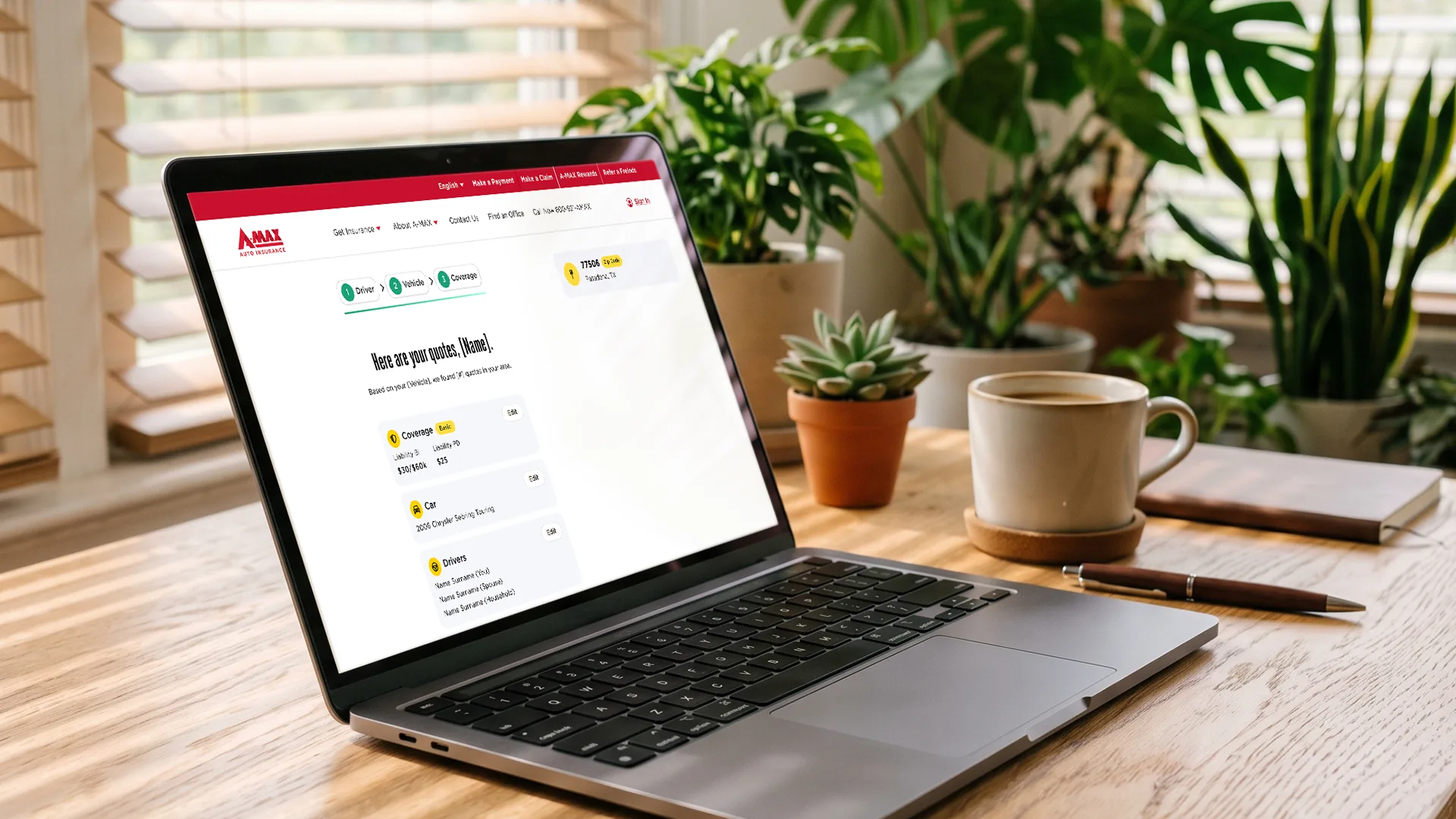
Redesigning AMAX's quote journey for stronger conversion
A research-led redesign of AMAX's online quote flow, rebuilt around what each person actually came to do.
Results
Simplified flows, clearer navigation, and streamlined key tasks made it effortless for policyholders to manage their accounts — improving usability, reducing drop-offs and support requests, and creating a more accessible, engaging app overall.
+5.7%
Quote-start to quote-finish conversion
Challenge
AMAX's quote flow tried to serve every user through a single path. Someone who wanted a number in thirty seconds went through the same process as someone ready to buy, and the drop-off showed it.
The approach
Before designing the mobile app, we needed to understand where the existing experience fell short for customers who increasingly relied on their phones.Our research highlighted several areas where the browser-based portal created friction, revealing clear opportunities for a more intuitive, mobile-centered solution.

Two paths, chosen early
A quick estimate for people who want a number, and a guided full quote for people comparing coverage.

Plain language at every decision
Coverage terms rewritten for the person choosing, not the underwriter.

Guidance where people hesitate
Support placed at the moments research showed people stalling, not buried in a help center.
The Journey
.webp)
.webp)
No items found.
Tools
The stack behind this project
The tools this project actually ran on, grouped by the part of the work each one served.
Design
<svg xmlns="http://www.w3.org/2000/svg" viewBox="0 0 384 512" aria-hidden="true" focusable="false"><path fill="currentColor" d="M14 95.8C14 42.9 56.9 0 109.8 0L274.2 0c52.9 0 95.8 42.9 95.8 95.8 0 33.5-17.2 63-43.2 80.1 26 17.1 43.2 46.6 43.2 80.1 0 52.9-42.9 95.8-95.8 95.8l-2.1 0c-24.8 0-47.4-9.4-64.4-24.9l0 88.3c0 53.6-44 96.8-97.4 96.8-52.8 0-96.3-42.8-96.3-95.8 0-33.5 17.2-63 43.2-80.1-26-17.1-43.2-46.6-43.2-80.1s17.2-63 43.2-80.1C31.2 158.8 14 129.3 14 95.8zm162.3 95.8l-66.5 0c-35.6 0-64.4 28.8-64.4 64.4 0 35.4 28.6 64.2 64 64.4l66.9 0 0-128.8zM207.7 256c0 35.6 28.8 64.4 64.4 64.4l2.1 0c35.6 0 64.4-28.8 64.4-64.4s-28.8-64.4-64.4-64.4l-2.1 0c-35.6 0-64.4 28.8-64.4 64.4zm-97.9 95.8l-.4 0c-35.4 .2-64 29-64 64.4s29.2 64.4 64.9 64.4c36.3 0 66-29.4 66-65.5l0-63.4-66.5 0zm0-320.4c-35.6 0-64.4 28.8-64.4 64.4s28.8 64.4 64.4 64.4l66.5 0 0-128.8-66.5 0zm97.9 128.8l66.5 0c35.6 0 64.4-28.8 64.4-64.4s-28.8-64.4-64.4-64.4l-66.5 0 0 128.8z"/></svg>
Figma
Design
<svg xmlns="http://www.w3.org/2000/svg" viewBox="0 0 24 24" aria-hidden="true" focusable="false"><path fill="currentColor" d="M1.126 16.547c-1.5013-1.4881-1.5013-3.9009 0-5.389l4.0778-4.042c1.2692-1.258 3.205-1.4525 4.6803-.5836.4564.2687.4524.8852.077 1.2573-.3753.372-.988.34-1.4975.1923-.6524-.1891-1.386-.0287-1.9006.4813l-4.0777 4.0419a1.8935 1.8935 0 0 0 0 2.6945c.7506.744 1.9678.744 2.7184 0l8.1555-8.0836c1.5014-1.4882 3.9355-1.4882 5.437 0l4.0778 4.0418c1.5013 1.4881 1.5013 3.901 0 5.389-1.5014 1.4882-3.9356 1.4882-5.437 0l-1.3593-1.3472-1.699 1.684c-1.2692 1.258-3.205 1.4526-4.6804.5837-.4563-.2687-.4523-.8852-.077-1.2573.3754-.372.988-.34 1.4975-.1923.6524.1892 1.386.0287 1.9006-.4813l1.7476-1.7322c.724-.7175 1.8975-.7175 2.6214 0l1.4078 1.3954c.7507.744 1.9678.744 2.7186 0a1.8936 1.8936 0 0 0 0-2.6945l-4.0779-4.0419c-.7507-.744-1.9678-.744-2.7185 0L6.563 16.5471c-1.5014 1.4882-3.9356 1.4881-5.437 0"/></svg>
Maze
Design
Build
<svg xmlns="http://www.w3.org/2000/svg" viewBox="0 0 384 512" aria-hidden="true" focusable="false"><path fill="currentColor" d="M14 95.8C14 42.9 56.9 0 109.8 0L274.2 0c52.9 0 95.8 42.9 95.8 95.8 0 33.5-17.2 63-43.2 80.1 26 17.1 43.2 46.6 43.2 80.1 0 52.9-42.9 95.8-95.8 95.8l-2.1 0c-24.8 0-47.4-9.4-64.4-24.9l0 88.3c0 53.6-44 96.8-97.4 96.8-52.8 0-96.3-42.8-96.3-95.8 0-33.5 17.2-63 43.2-80.1-26-17.1-43.2-46.6-43.2-80.1s17.2-63 43.2-80.1C31.2 158.8 14 129.3 14 95.8zm162.3 95.8l-66.5 0c-35.6 0-64.4 28.8-64.4 64.4 0 35.4 28.6 64.2 64 64.4l66.9 0 0-128.8zM207.7 256c0 35.6 28.8 64.4 64.4 64.4l2.1 0c35.6 0 64.4-28.8 64.4-64.4s-28.8-64.4-64.4-64.4l-2.1 0c-35.6 0-64.4 28.8-64.4 64.4zm-97.9 95.8l-.4 0c-35.4 .2-64 29-64 64.4s29.2 64.4 64.9 64.4c36.3 0 66-29.4 66-65.5l0-63.4-66.5 0zm0-320.4c-35.6 0-64.4 28.8-64.4 64.4s28.8 64.4 64.4 64.4l66.5 0 0-128.8-66.5 0zm97.9 128.8l66.5 0c35.6 0 64.4-28.8 64.4-64.4s-28.8-64.4-64.4-64.4l-66.5 0 0 128.8z"/></svg>
Figma
Design
<svg xmlns="http://www.w3.org/2000/svg" viewBox="0 0 24 24" aria-hidden="true" focusable="false"><path fill="currentColor" d="M1.126 16.547c-1.5013-1.4881-1.5013-3.9009 0-5.389l4.0778-4.042c1.2692-1.258 3.205-1.4525 4.6803-.5836.4564.2687.4524.8852.077 1.2573-.3753.372-.988.34-1.4975.1923-.6524-.1891-1.386-.0287-1.9006.4813l-4.0777 4.0419a1.8935 1.8935 0 0 0 0 2.6945c.7506.744 1.9678.744 2.7184 0l8.1555-8.0836c1.5014-1.4882 3.9355-1.4882 5.437 0l4.0778 4.0418c1.5013 1.4881 1.5013 3.901 0 5.389-1.5014 1.4882-3.9356 1.4882-5.437 0l-1.3593-1.3472-1.699 1.684c-1.2692 1.258-3.205 1.4526-4.6804.5837-.4563-.2687-.4523-.8852-.077-1.2573.3754-.372.988-.34 1.4975-.1923.6524.1892 1.386.0287 1.9006-.4813l1.7476-1.7322c.724-.7175 1.8975-.7175 2.6214 0l1.4078 1.3954c.7507.744 1.9678.744 2.7186 0a1.8936 1.8936 0 0 0 0-2.6945l-4.0779-4.0419c-.7507-.744-1.9678-.744-2.7185 0L6.563 16.5471c-1.5014 1.4882-3.9356 1.4881-5.437 0"/></svg>
Maze
Design
Growth
<svg xmlns="http://www.w3.org/2000/svg" viewBox="0 0 384 512" aria-hidden="true" focusable="false"><path fill="currentColor" d="M14 95.8C14 42.9 56.9 0 109.8 0L274.2 0c52.9 0 95.8 42.9 95.8 95.8 0 33.5-17.2 63-43.2 80.1 26 17.1 43.2 46.6 43.2 80.1 0 52.9-42.9 95.8-95.8 95.8l-2.1 0c-24.8 0-47.4-9.4-64.4-24.9l0 88.3c0 53.6-44 96.8-97.4 96.8-52.8 0-96.3-42.8-96.3-95.8 0-33.5 17.2-63 43.2-80.1-26-17.1-43.2-46.6-43.2-80.1s17.2-63 43.2-80.1C31.2 158.8 14 129.3 14 95.8zm162.3 95.8l-66.5 0c-35.6 0-64.4 28.8-64.4 64.4 0 35.4 28.6 64.2 64 64.4l66.9 0 0-128.8zM207.7 256c0 35.6 28.8 64.4 64.4 64.4l2.1 0c35.6 0 64.4-28.8 64.4-64.4s-28.8-64.4-64.4-64.4l-2.1 0c-35.6 0-64.4 28.8-64.4 64.4zm-97.9 95.8l-.4 0c-35.4 .2-64 29-64 64.4s29.2 64.4 64.9 64.4c36.3 0 66-29.4 66-65.5l0-63.4-66.5 0zm0-320.4c-35.6 0-64.4 28.8-64.4 64.4s28.8 64.4 64.4 64.4l66.5 0 0-128.8-66.5 0zm97.9 128.8l66.5 0c35.6 0 64.4-28.8 64.4-64.4s-28.8-64.4-64.4-64.4l-66.5 0 0 128.8z"/></svg>
Figma
Design
<svg xmlns="http://www.w3.org/2000/svg" viewBox="0 0 24 24" aria-hidden="true" focusable="false"><path fill="currentColor" d="M1.126 16.547c-1.5013-1.4881-1.5013-3.9009 0-5.389l4.0778-4.042c1.2692-1.258 3.205-1.4525 4.6803-.5836.4564.2687.4524.8852.077 1.2573-.3753.372-.988.34-1.4975.1923-.6524-.1891-1.386-.0287-1.9006.4813l-4.0777 4.0419a1.8935 1.8935 0 0 0 0 2.6945c.7506.744 1.9678.744 2.7184 0l8.1555-8.0836c1.5014-1.4882 3.9355-1.4882 5.437 0l4.0778 4.0418c1.5013 1.4881 1.5013 3.901 0 5.389-1.5014 1.4882-3.9356 1.4882-5.437 0l-1.3593-1.3472-1.699 1.684c-1.2692 1.258-3.205 1.4526-4.6804.5837-.4563-.2687-.4523-.8852-.077-1.2573.3754-.372.988-.34 1.4975-.1923.6524.1892 1.386.0287 1.9006-.4813l1.7476-1.7322c.724-.7175 1.8975-.7175 2.6214 0l1.4078 1.3954c.7507.744 1.9678.744 2.7186 0a1.8936 1.8936 0 0 0 0-2.6945l-4.0779-4.0419c-.7507-.744-1.9678-.744-2.7185 0L6.563 16.5471c-1.5014 1.4882-3.9356 1.4881-5.437 0"/></svg>
Maze
Design
Want results like this
Portfolio
More projects
Related work, by service and by industry.