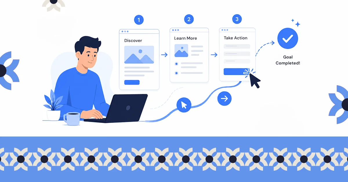
.svg)
.svg)


You improve website UX by removing friction at the points where people are trying to act: faster load times, mobile-first layouts, navigation people can predict, content that can be scanned, and forms that do not ask for more than they need.
What determines whether your website actually works isn’t just how it looks, it’s the experience people have when they use it.
You can have a great design idea, but if it doesn’t support the user journey; what people came to do, then it won’t deliver results. And when that happens, visitors leave without taking action.
The good part is, once you spot where things are breaking down, there are practical ways to fix it.
So how do you increase user experience on your website? In this guide, you’ll find 12 practical ways to improve it, simple changes that make your site easier to use, keep visitors engaged, and help turn them into customers, even if you’re not a designer.
But first, it’s important to understand what user experience on a website really means, and how it shapes whether visitors stay or leave.
What Is User Experience (UX) on a Website?
User experience (UX) refers to how visitors feel when they interact with your website. A site with good UX makes it easy for people to understand what you offer, find the information they need, and complete tasks without frustration.
Most visitors aren’t thinking about layouts or interface patterns when they arrive. They’re thinking “I need to get this done,” whether that means finding information, booking a service, or making a purchase. User experience decides whether that task feels easy or turns into work.
In practice, strong website UX comes down to four key elements:
- Usefulness: the website solves a real problem or answers an important question.
- Usability: visitors can navigate the site easily and understand where to go next.
- Accessibility: the website works for everyone, including people with disabilities.
- Desirability: the design feels clean, professional, and trustworthy.
You can think of your website like a well-organized store. When everything is clearly arranged and easy to find, customers enjoy the experience and stay longer. When it’s confusing or cluttered, they leave.
That’s why improving UX isn’t just about design; it directly affects business results. When a button leads somewhere unexpected or the next step is hard to find, many visitors simply leave and try somewhere else.
When user experience improves, websites typically see lower bounce rates, longer visits, higher conversions, and better search visibility. Simply put, a better experience makes it easier for visitors to become customers.
How Can You Increase User Experience on a Website?
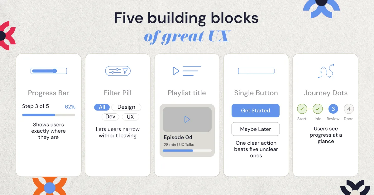
.jpeg)
So how do you create a website experience that people actually enjoy using and want to come back to? It often comes down to making your site easier, faster, and more intuitive to navigate.
Here are 12 practical ways to increase user experience on a website.
1. How Can You Make Your Website Load Faster?
Speed plays a huge role in how users experience your website. If a page takes too long to load, many visitors will leave before they even see your content.
To improve your website’s speed:
- Compress large images so they load faster without losing quality.
- Serve images in modern formats such as WebP.
- Lazy load images so they only load when they scroll into view.
- Enable browser caching so returning visitors don’t have to reload everything.
- Remove unused scripts and plugins that add weight to every page.
- Use a content delivery network (CDN) to deliver your website faster to users in different locations.
Perceived speed matters too. Platforms like LinkedIn and YouTube use skeleton screens and progressive loading, so content appears gradually instead of leaving people staring at a blank page.
Even small improvements in load time can make a noticeable difference in how long visitors stay on your site.
2. Design Mobile-First Experiences
Most people now visit websites on their phones. If your site is hard to use on a small screen, has tiny text, crowded menus, or buttons that are difficult to tap, visitors will leave quickly.
To improve the mobile experience:
- Use responsive layouts that automatically adjust to smaller screens, stacking columns vertically on phones.
- Make buttons and links large enough to tap easily, at least 44px for touch targets.
- Keep text readable without zooming.
- Test your site on real phones and tablets, not just a desktop preview.
When your website works smoothly on mobile, users can navigate faster, complete actions easily, and stay on your site longer.
3. What Makes Website Navigation Intuitive?
Your navigation should help visitors find what they’re looking for quickly. If menus are crowded or confusing, many users will leave instead of trying to figure out where things are.
To make navigation easier:
- Keep the main menu simple; around 5 to 7 items is usually enough.
- Group related pages under clear parent sections.
- Use clear labels like “Pricing,” “Services,” or “Contact” instead of vague names.
- Keep navigation in the same place on every page.
- Add breadcrumbs so people can move back up from deeper pages.
- Add a search bar if your site has many pages or a lot of content.
The same idea applies to flows, not just menus. In one NUUX project, we restructured the quote experience for an insurance platform. The original flow sent users through several confusing steps, so the redesign broke it into clearer steps that guide people from start to finish.
When navigation is simple and organized, visitors can move through your site smoothly and reach what they need faster.
4. How Do You Make Your Content Easy to Scan?
When a page looks crowded or full of long text blocks, visitors often skip it. Clear, well-spaced content helps people scan quickly and understand information faster.
To make your content easier to read:
- Break text into short paragraphs instead of long blocks.
- Use bullet points or lists to highlight key information.
- Keep sentences simple and direct.
Visual hierarchy does a lot of this work. A clear type scale, with larger page headlines, smaller section headings, and body text around 16 to 18px, tells people what to read first. Extra white space between sections lets them take in one idea at a time.
Many people also scan pages in an F-pattern: across the top, then down the left side. Placing key messages and calls-to-action along that path makes them easier to spot.
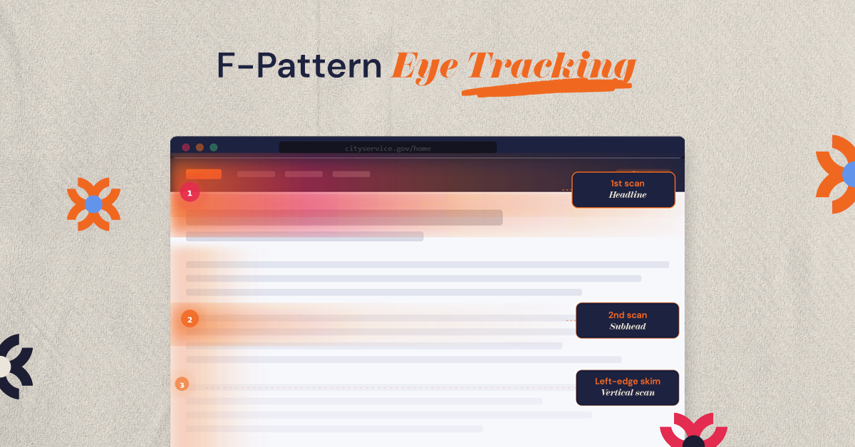
When your content is easier to scan, visitors can quickly find what matters to them and stay engaged with your site.
5. How Do You Make Your Website Accessible to Everyone?
Your website should be easy to use for everyone, including people who rely on screen readers or keyboard navigation. Improving accessibility not only helps more users interact with your site, it also improves overall usability.
Here are a few practical ways to improve accessibility:
- Add descriptive alt text to images so screen readers can explain them.
- Use strong color contrast so text is easy to read on any screen.
- Make sure the site can be navigated with a keyboard, not just a mouse.
- Label every form field clearly so people know what to enter.
The WCAG guidelines are a useful checklist for these basics and more.
Small accessibility improvements can make your website easier for everyone to use.
6. Use Clear Calls-to-Action
Visitors should always know what to do next when they land on your website. If your calls-to-action (CTAs) are hard to notice or too vague, many users will leave without taking any action.
To make your CTAs more effective:
- Use buttons that stand out from the rest of the page.
- Write clear action phrases like “Get a Quote,” “Book a Call,” or “Start Free Trial.”
- Place them where users naturally look, such as after key sections or at the top of pages.
Clear CTAs make it easier for visitors to take the next step, which often leads to better conversion rates.
7. Keep Forms and Checkouts Simple
Long or complicated forms often cause users to abandon the process. The more effort it takes to fill something out, the more likely visitors are to leave.
To make forms easier to complete:
- Ask only for essential information. Remove fields that aren’t truly necessary.
- Allow guest checkout so users don’t have to create an account first.
- Show instant error messages if something is entered incorrectly.
The simpler the process feels, the more likely users are to complete it.
8. What Can You Learn From Watching Real Users?
Sometimes the easiest way to improve your website is simply to watch how people use it. Real users often struggle with things that designers or business owners do not notice, which is why many businesses run UX audits to identify friction points across the user journey.
Here are simple ways to learn from users:
- Run quick usability tests and watch how people navigate your site.
- Add short feedback surveys asking visitors if they found what they needed.
- Use heatmaps or session recordings to see where users click or get stuck.
- Check user flow reports to find the exact step where people drop off.
- Conduct a UX audit to identify broader usability issues affecting the overall experience.
For example, if a checkout shows a big drop-off at the payment step, session recordings may show people getting stuck on a form field or an unclear error message. Tools like Hotjar, Maze, and Google Analytics make these patterns easier to find.
Much of our work at NUUX Design Studios starts with this kind of behavioral review, so design decisions follow what users actually do rather than internal opinion. Small insights from real users can reveal quick fixes that greatly improve UX.
9. Use Personalization Where It Helps
Personalization can make a website feel more relevant to visitors. When users see content that matches their needs or location, it’s easier for them to engage.
Practical ways to do this include:
- Show location-based information, like nearby services or shipping details.
- Recommend related products or content based on what users view.
- Highlight relevant offers or services for returning visitors.
The key is to keep personalization simple and helpful, not overwhelming.
10. Make Errors Easy to Recover From
Mistakes happen, forms fail, links break, or pages disappear. What matters is how your website helps users recover.
To handle errors better:
- Create helpful 404 pages with links back to important sections.
- Write clear error messages that explain what went wrong.
- Suggest the next step, such as returning to the homepage or trying again.
When users know how to fix a problem quickly, they’re more likely to stay on your site.
11. Keep Your Design Consistent
Consistency makes a website easier to use. When pages follow the same design patterns, users quickly understand how everything works.
To maintain consistency:
- Use the same fonts and colors across the site.
- Keep buttons styled the same way on every page.
- Place navigation and key elements in the same locations.
A consistent design reduces confusion and makes your website feel more professional.
12. Keep Improving Over Time
Good UX isn’t a one-time task. Websites perform best when they’re regularly reviewed and improved.
Simple ways to keep improving include:
- Run A/B tests to see which layouts or buttons perform better.
- Check analytics regularly to spot pages where users drop off.
- Review heatmaps and click data to see how people interact with your site.
Even small adjustments can lead to better engagement and higher conversions over time.
How Do You Measure and Track UX Improvements?
Improving UX works best when you track what changes actually improve the experience. Looking at a few key metrics can quickly show whether users are finding your site easier to use.
Focus on these practical indicators:
- Bounce rate: shows how many visitors leave after viewing one page. A high number may mean the page isn’t meeting user expectations.
- Time on page: indicates whether people are actually engaging with your content.
- Conversion rate: tracks how many visitors complete actions like filling out a form, booking a call, or making a purchase.
- Customer Effort Score (CES): measures how easy it feels for users to complete a task on your site.
You can monitor these using Google Analytics, heatmaps, or short feedback surveys. Checking these metrics regularly helps you see what’s working and where the user experience can improve.
Conclusion
Improving UX doesn’t always require a complete redesign. Often, the biggest improvements come from small changes: faster page speeds, clearer navigation, simpler forms, and better mobile experiences.
If you want expert help turning your website into a faster, more intuitive, and higher-converting experience, NUUX Design Studios specializes in creating exceptional digital experiences.
Book a free 30-minute consultation with NUUX Design Studios and discover how better UX can drive real business growth.
Want results like this
Your website should make money, not excuses. Let us find the revenue hiding in your current experience.
FAQs
Quick answers to the questions we hear most about website conversion and UX design.
Improving page speed and simplifying navigation are usually the quickest wins. At NUUX Design Studios, these are often the first areas we optimize during UX audits.
High bounce rates, abandoned forms, and low conversions often signal UX issues. A UX review helps identify where users encounter friction.
Search engines consider signals like page speed, mobile usability, and engagement. Strong UX helps users stay longer on your site, which can improve rankings.
UX design focuses on how users navigate and complete tasks. UI design focuses on visual elements like layout and typography. At NUUX Design Studios, both are designed together.
Tools like Google Analytics, heatmaps, session recordings, usability testing tools, and user feedback surveys help measure how people interact with a website.
Related articles
More field notes on conversion, UX, and building websites that sell.