.svg)
.svg)
Feeding Bird
Overview
FeedingBird came to us with a challenge that immediately stood out.
They were entering a market with established players already offering wills, trusts, estate planning, healthcare directives, and other legal services. So the question was never just, “How do we make another estate planning website?”
How do we make
this feel different?
How do we make a heavy topic feel less overwhelming?
Conversions earned
.webp)
.webp)

.webp)
.webp)
At the center of the experience was a topic most people naturally avoid: planning for after they are gone, preparing their loved ones, organizing their wishes, and navigating difficult legal decisions.
FeedingBird’s goal was not to create something corporate, cold, or intimidating. Their goal was to make people feel like someone was there helping them through the process.
That direction resonated with us immediately because it aligned closely with how we approach our own work at NUUX: creating experiences that feel collaborative, warm, approachable, and human
The challenge became:
How do we translate warmth, guidance, and emotional support into an actual web experience?
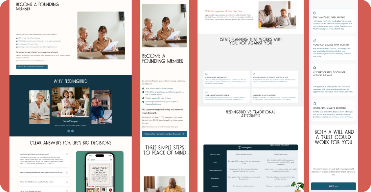
Translating the Brand Into a Guided Web Experience
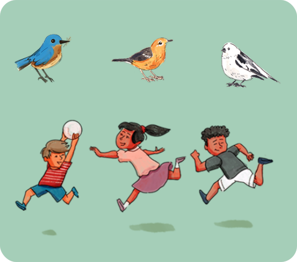
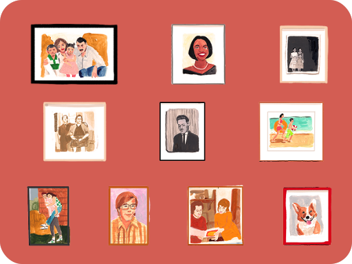
FeedingBird already had a strong visual tone. The brand felt warm, nostalgic, emotional, and human, with much of the existing language leaning into illustration and storytelling.
Our role was to extend that feeling into a scalable website experience.
We studied the existing visual language, identified what emotionally made it work, and began translating static brand moments into interactive web experiences.
The strategic direction was simple:
The website should feel like guidance, not information.

Designing Education Into the Experience
Education became one of the most important parts of the project.
The goal was not just to tell users information. The goal was to help users understand themselves.
What do they need? What applies to them? What makes sense for their situation?
Because users were not entering FeedingBird as experts, we did not want education to live only in articles or long blocks of content. We designed it directly into the product journey.
This included mini quizzes, interactive educational components, comparison sections, guided recommendation flows, and assessment experiences.
How we built warmth into the user journey
Another important part of the strategy was making sure the marketing site and application experience felt connected.
We did not want users to feel like they were entering a completely separate system after completing the assessment.
01
Emotional mapping first
We charted the user's emotional state at each step. Anxiety was highest at the start, so we placed the most human, reassuring elements there.
02
Progressive disclosure of complexity
Legal jargon was never eliminated, only introduced at the moment it became relevant and necessary for the user to proceed.
The experience was designed to make the move from marketing site to product feel natural, not like entering a completely separate system.
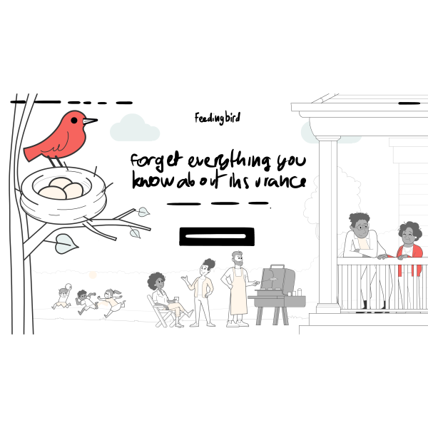
Shaping the story
We began with rough sketches and early concepts to explore the emotional direction of the homepage animation. The focus was less on visual polish and more on finding the right feeling: supportive, calm, and approachable.
Building the visual language
Jargon was never eliminated, only revealed at the moment it became relevant. This kept the user moving forward without feeling overwhelmed.

Bringing it to life with motion
We designed the marketing site to prime users for the application. The shift from learning to doing felt like a single, uninterrupted breath.
Conclusion
The final experience helps users move through a difficult topic with more clarity, confidence, and emotional support.
Instead of overwhelming people with legal information, the website guides them step by step through education, interaction, assessment, and product handoff.
And instead of feeling like a traditional legal website, the experience feels warmer, more personal, and more human.
For FeedingBird, good UX was not about making the experience flashy.
It was about helping people move through uncertainty with confidence.