


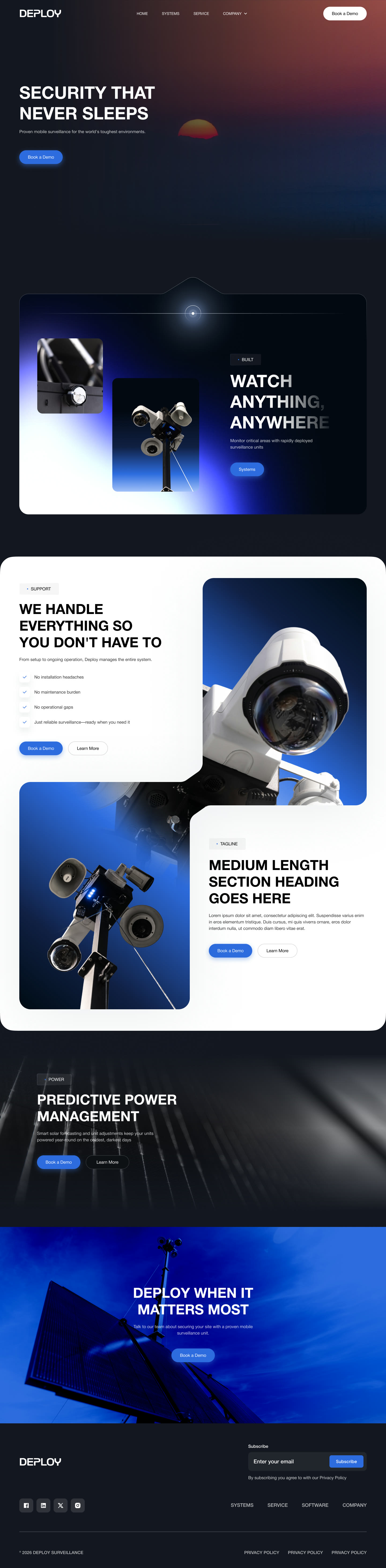
Round one
A middle ground between our approach and their boards. Deploy liked it, then asked us to scale back: it felt close to Apple, had too much blue, overlays made images look lifted, and sections blended together.
A full website redesign for a company selling something many buyers don’t know they need yet.
01 · The brief
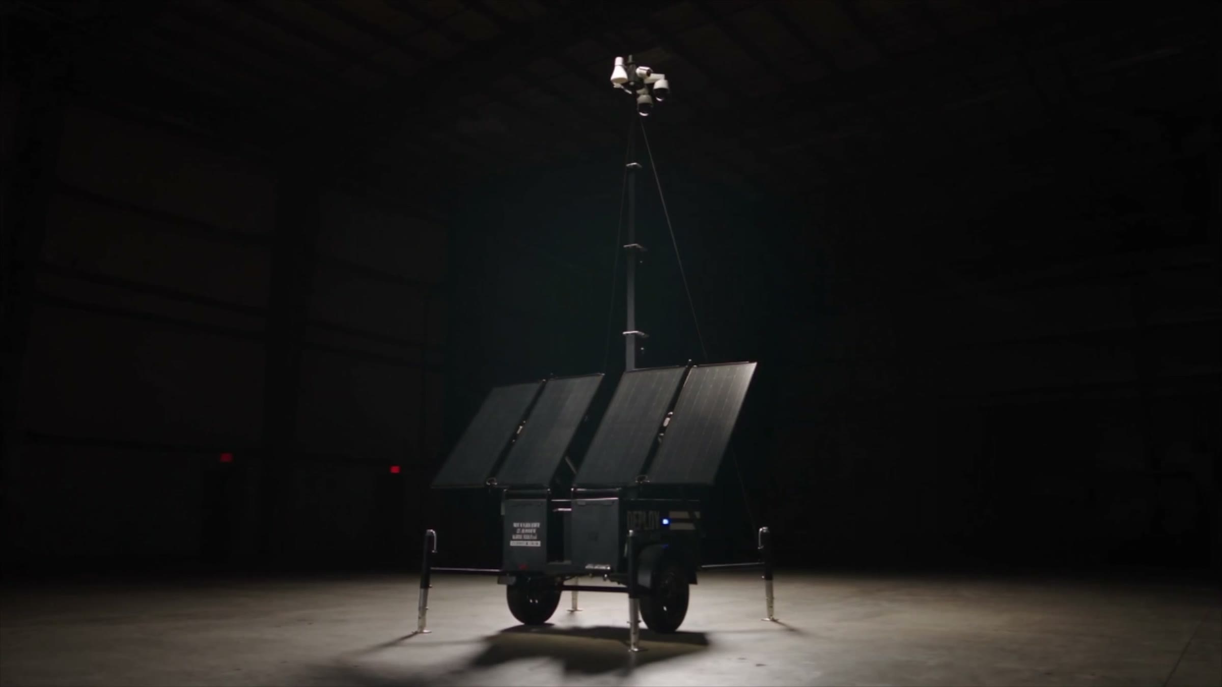
Deploy came to us for a refresh. The site was dated, and it didn’t tell the company’s story well.
01 · The brief
The sales team needed something they could open on a call and walk a buyer through.
01 · The brief
The refresh had to tell the company’s story, not just update the look.
02 · Why the unit leads
The site had a second job from day one: a presentation the sales team can use on calls. For now, the site is the front door.
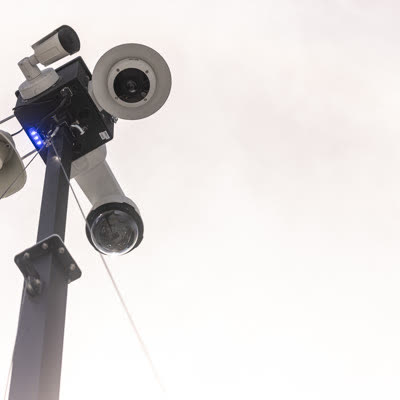
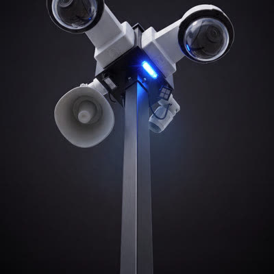
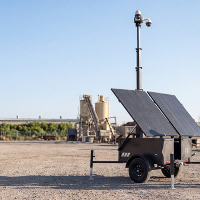
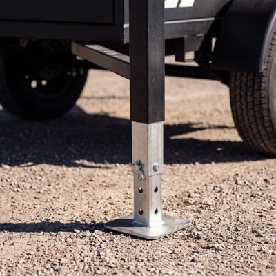
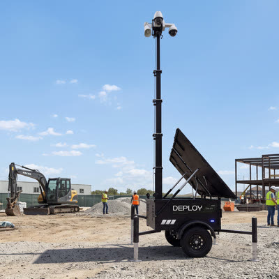
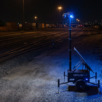
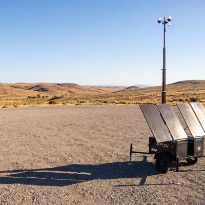
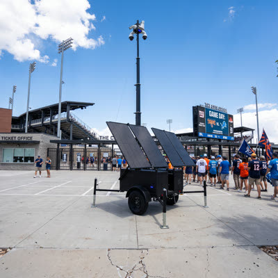
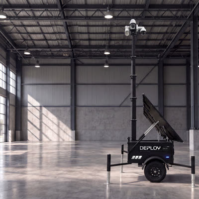
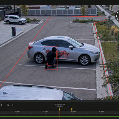
Many customers arrive without knowing they need a unit, or what the risk is without one. The site has to explain why surveillance matters, then show what Deploy offers and what it can do. So the unit became the center of every section.
03 · Too much at once
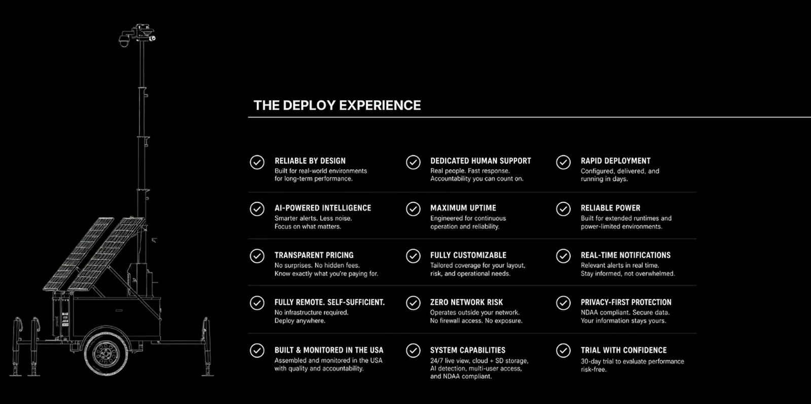
The diagram called out every capability in one image. Accurate, but a lot to take in, especially for a first-time visitor with no context, where every callout competes for attention.
Break the diagram into a scroll interaction: one capability at a time, at the visitor’s own pace.
Simplify further: the unit, one short line of text, and a light transition between moments.
04 · The animation
From a first concept to the version that shipped.
05 · Look and feel
Deploy’s inspiration boards pointed at SpaceX and Anduril: dark, government-focused, built around the product. Round one found a middle ground and the client asked to scale back. Round two let each section stand alone, tall and full viewport. The one they preferred.


05 · Look and feel
We tested the direction in rounds with Deploy, and each round told us what to keep.
A middle ground between our approach and their boards. Deploy liked it, then asked us to scale back: it felt close to Apple, had too much blue, overlays made images look lifted, and sections blended together.
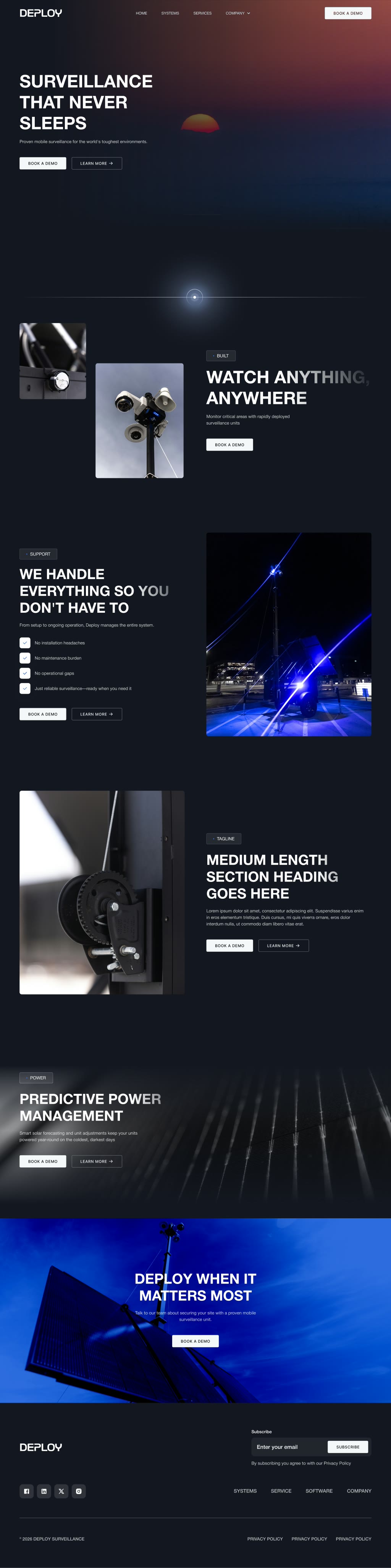
Each section stands alone. Tall, full-viewport sections, closer to SpaceX and Anduril. This is the direction Deploy preferred.

The final version, and what is live on the Deploy site today.
06 · The details
Hard clashes between sections make a site read like text and an image on a page.










07 · Booking
We connected Deploy’s HubSpot so a visitor can book a time right on the site, styled to match the brand instead of dropping into a stock embed. It keeps the momentum from the unit: you see it, you want to talk, you book.
08 · Where it landed
A homepage built for the sales call and beyond.



“NUUX is helping us build a more professional brand presence online. This benefits us by displaying to prospective and current customers our level of professionalism and the premium experience they get with us.”
Spencer K.
Deploy Surveillance
Read the review on G2Let’s turn your vision into something people can click, use, and appreciate.