.svg)
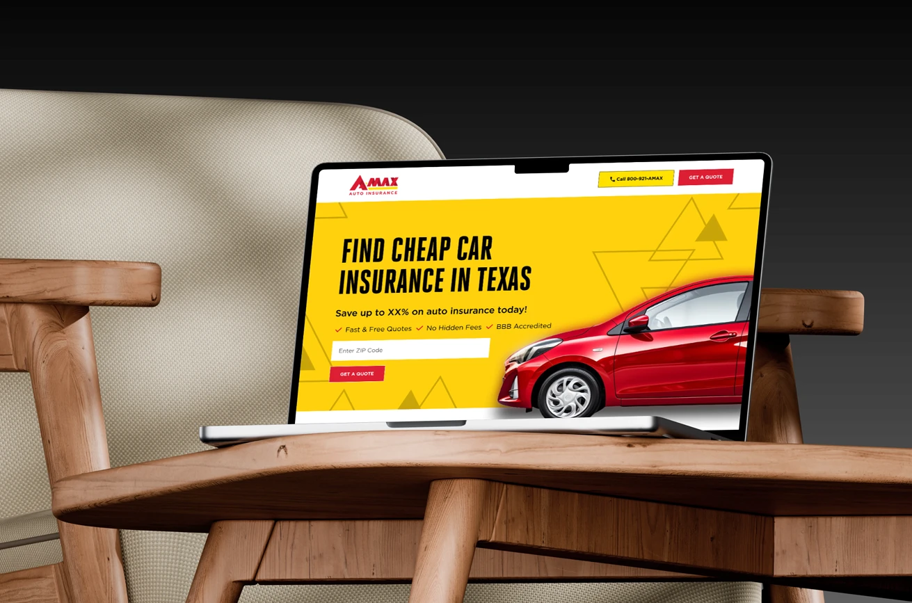
Through exploratory research, we identified that AMAX’s quote journey was trying to serve all users with a single path, creating confusion and unnecessary drop-off. Some users wanted a quick estimate, while others were ready to provide full details for an accurate quote. The existing flow didn’t support either group well. We redesigned the experience around these distinct behaviors, creating a clearer, more guided journey that reduces effort and increases quote completion rates.
Too Much Information at Once
Users were presented with multiple decisions and questions on a single screen, creating unnecessary pressure and causing many to pause or exit the flow.
Coverage Terms Were Hard to Interpret
The language used to describe coverage options wasn’t easy for everyday users to understand. Without simple explanations, many struggled to choose confidently.
Unclear Purpose Behind Requested Information
Users were asked for personal details without knowing why the information was needed. This lack of context lowered trust and reduced willingness to continue.
One Path That Didn’t Fit Every User
High-intent shoppers and casual browsers were forced through the same experience. This created friction for both groups and limited AMAX’s ability to capture leads effectively.
No Adaptation for Returning or Existing Customers
Users coming back to resume a quote, or existing policyholders seeking a new one, weren’t recognized. This meant repeating steps and re-entering details that slowed progress and hurt engagement.
Limited Guidance When Users Needed Support
Explanations for coverage choices were difficult to find, and help elements weren’t prominent. Without clear guidance at the right moments, users were left guessing their way forward.
.svg)
Create Two Clear Paths for Different User Needs
Give users the option to get a quick estimate or a full quote, reducing friction and improving relevance for both high-intent shoppers and casual browsers.
Simplify Decisions With Plain Language
Replace technical coverage terms with straightforward explanations so users can understand options quickly and choose with confidence.
Provide Guidance at the Right Moments
Introduce tooltips, inline descriptions, and contextual help that explain why information is needed and what it will be used for.
Personalized Experience Based on User Type
Recognize returning users, existing customers, and resumed quotes to avoid redundancy and tailor the flow to their situation.
Reduce Cognitive Load Across the Journey
Break up dense screens, improve pacing, and streamline the order of questions to keep users focused and moving forward.
.svg)
.svg)
-min.png)
.svg)
.svg)


"NUUX Design Studios delivered outstanding work across several UX/UI projects, including key landing pages. Their attention to detail, clear communication, and ability to consistently meet expectations made them a trusted design partner."
.svg)
.svg)
.svg)
Through exploratory research, we identified that AMAX’s quote journey was trying to serve all users with a single path, creating confusion and unnecessary drop-off. Some users wanted a quick estimate, while others were ready to provide full details for an accurate quote. The existing flow didn’t support either group well. We redesigned the experience around these distinct behaviors, creating a clearer, more guided journey that reduces effort and increases quote completion rates.


.png)
.png)
.png)
.svg)

.svg)

.svg)
